
Did you ever visit a website and immediately feel lost or annoyed? You’re not alone. The online era has made your site the first impression of your business to your potential customers. But what if your location is in fact sending them away?
It is time to explore the real-life examples of bad website design that are silently killing your conversions- and, more to the point, how you can correct this.
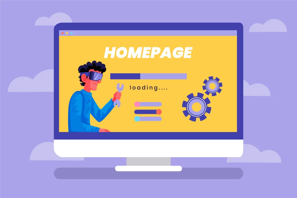
Why Does Website Design Matter So Much?
Did you realize that 94 per cent of the first impressions are design-based, and the user forms their opinion of your site in 0.05 seconds?
What is more impressive, 75 percent of users determine the credibility of a company according to its web design. When your site appears old-fashioned, messy, or disconcerting, you are losing credibility- and business- even before you ever get to make your sales pitch.
1. Cluttered Layouts and Overwhelming Interfaces
Cluttered layouts are one of the typical errors to begin with. Your homepage is too full of banners, pop-ups, widgets, and thick navigation, and this gives the impression to visitors that they are overwhelmed. Actually, 92 percent of users indicate that they change to another competitor because of cluttered layouts.
The proliferation of pages creates a cognitive load, causing a rise in the bounce rate and a decrease in engagement.
Real Example
Other websites, like the Daily News, flood their sites with advertisements and pop-ups and leave the reader with no progress to read what the actual news is.
Actionable Tip
Embrace white space. An uncomplicated and clean design with a lot of breathing space improves the user’s concentration by up to 20 percent and makes the content in your copy easier to read.
2. Navigation and Site Structure Problems
Users will drop out when they do not get what they want in a few seconds. Confusing menus, not immediately apparent navigation or page balances are conversion killers. According to research, bad navigation would send away 37 per cent of users.
Real Example
The Yale School of Art site has a notorious reputation of being difficult to navigate due to its confusing layouts and inconsistency, and almost impossible to locate the appropriate content.
Actionable Tip
Use menus, transparent, uniform, and logical hierarchies of pages. Group-level items do not offer users a big selection of items related to each other.
3. Slow Loading Speed
Patience is thin online. Any site that takes longer than three seconds to load will lose over 50 percent of its traffic. An additional delay of one second can reduce the conversions by 7 percent. It is a huge loss of revenue over such a basic thing as unoptimized pictures or bulky code.
Real Example
Walmart improved the loading time and made a conversion increase with each second of improvement.
Actionable Tip
Speed issues are diagnosed and fixed through image compression, code reduction, and other tools, including Google PageSpeed Insights.
4. Poor and Non-Responsive Mobile Design
Over 60 percent of web traffic is made by using mobile gadgets; therefore, a site that does not adapt excellently to every screen size is a nightmare to convert. Mobile users abandon a task on a website five times as often when there has not been a mobile optimization.
Real Example
Other websites, such as Penny Juice and Craigslist, are not responsive on mobile, which makes them frustrating to mobile users.
Actionable Tip
Make it mobile-friendly for all gadgets. Make sure that you test your site with various screen sizes and that you give mobile usability a top priority.
5. Unclear or Ineffective Calls-to-Action (CTAs)
The bridge between visitor and customer lies in your CTA. When it is imprecise, obscure, and generic, the users will not know how to go about it. Custom CTAs convert 42 percent of the visitors compared to generic CTAs.
Real Example
The website of Onyx Accountants does not have effective CTAs, and it is hard to direct users to conversion actions such as making a consultation.
Actionable Tip
Your CTAs should be written in action and contrasting colors. Make them visible and put them in a position where they can be discovered by the users.
6. Outdated Visuals and Inconsistent Branding
It is all about first impressions. The bad quality of the images, lack of consistency in branding, and use of outdated design would make your business look unprofessional and unreliable to 75 percent of consumers.
Real Example
The old-fashioned appearance of the Santa Pod Raceway and the insignificance of modern design are the first signs that it is poorly maintained, which negatively affects the reputation and the possibility of lead generation.
Actionable Tip
Stick with the same design features- fonts, colors, styles of buttons- on all pages. Change graphics frequently to maintain a new and reputable site.
7. Annoying Pop-Ups and Intrusive Ads
Pop-ups can be useful, but excessive usage is a sure way of scaring off users. There are various pop-ups that elevate the bounce rates and decrease the trust.
Real Example
Certain news sources are also interested in advertisement revenue, and their user experience is sometimes low because of pushy advertising.
Actionable Tip
Pop-ups should be used with minimal frequency and must be easy to get rid of. Concentrate on giving and then seek to be given.
8. Lack of Trust Signals and Social Proof
Users have fewer chances of converting without seeing any signs of trust, like testimonials, reviews, and security badges. Social evidence may increase the chances of conversion by more than 100%.
Real Example
Most e-commerce businesses are losing sales just because they are not showing badges of trust or reviews from their customers on the checkout pages.
Actionable Tip
Display testimonials, client logos, certifications, and security badges in big fonts. Encourage users to trust you.
Wrap-Up
To wrap it up, with these tips in mind, you will not only enhance your website user experience but also send positive E-E-A-T signals to Google, increasing your credibility, authority, and trustworthiness in the eyes of the user and search engine.